RADIATING HEALTH & WELLBEING
Brand Identity, Packaging, Literature, Stationery, Promotional Material, Animation & Illustration
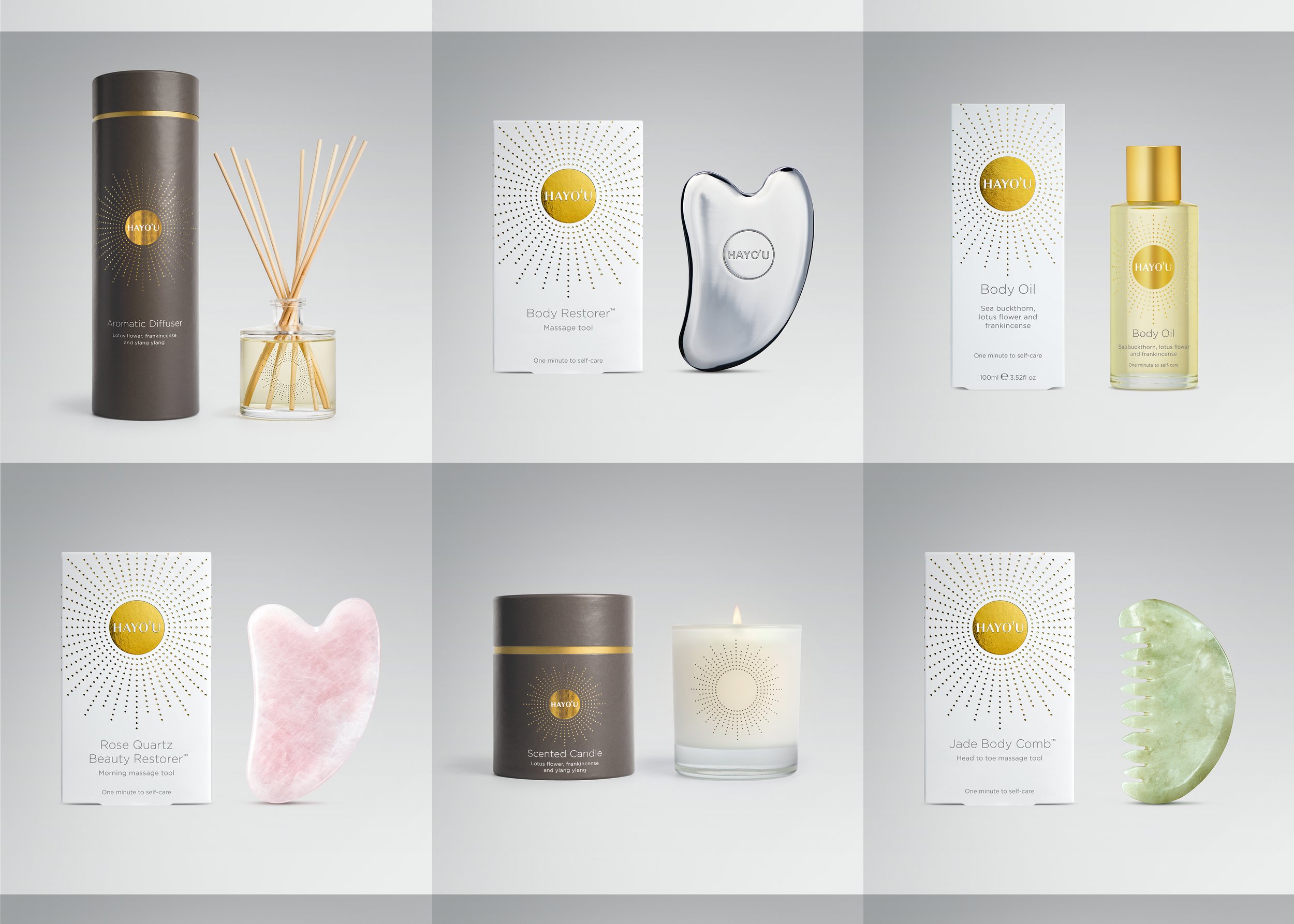
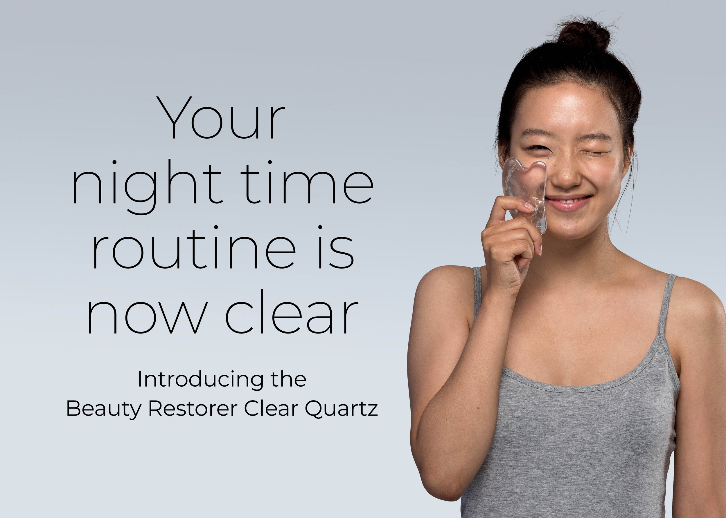
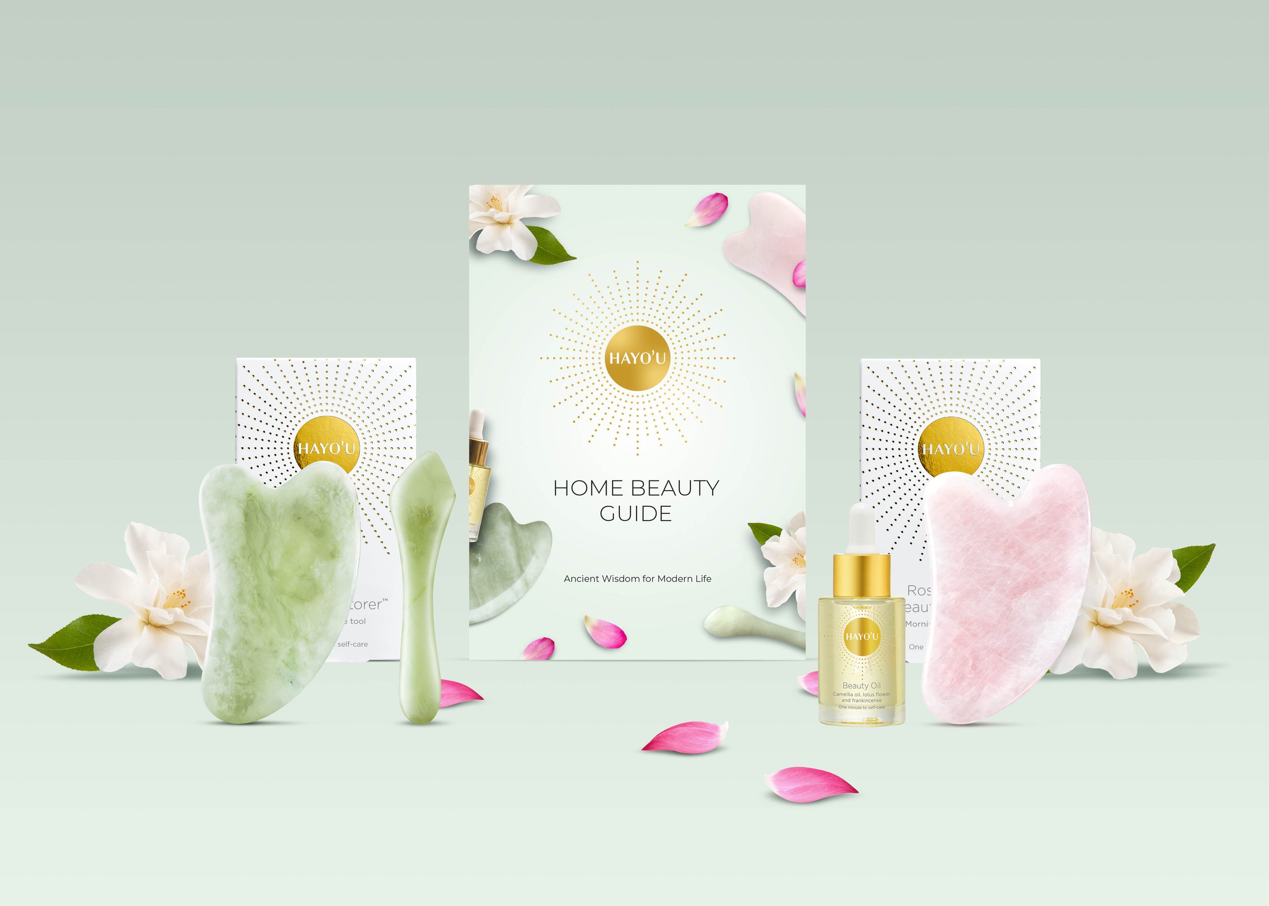
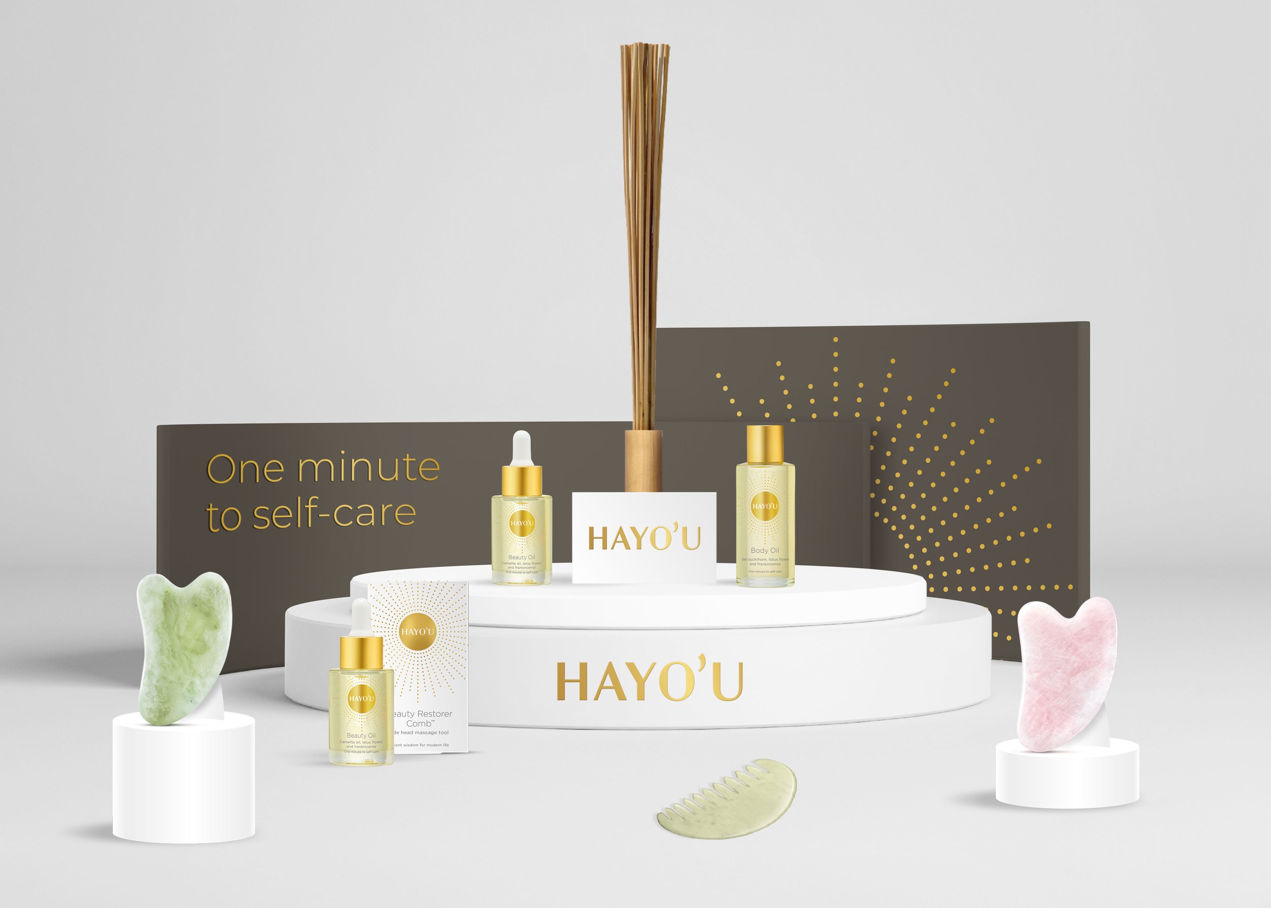
Hayo’u is a ground-breaking self-treatment method, inspired by Chinese medicine. Based on the concept of Yang Sheng (nurture life), the Hayo’u Method addresses the root cause of most modern illness – stress. Hayo’u comprises a series of daily rituals that help to reduce stress and inflammation by relaxing the body, enabling free-flow circulation and assisting detoxification. Some of these rituals involve the usage of tools that are produced exclusively by Hayo’u.
The previous Hayo’u pack designs focused on Chinese inspired illustration and bold typography. It also looked a little old fashioned and struggled to fit in with the world of premium healthcare brands.
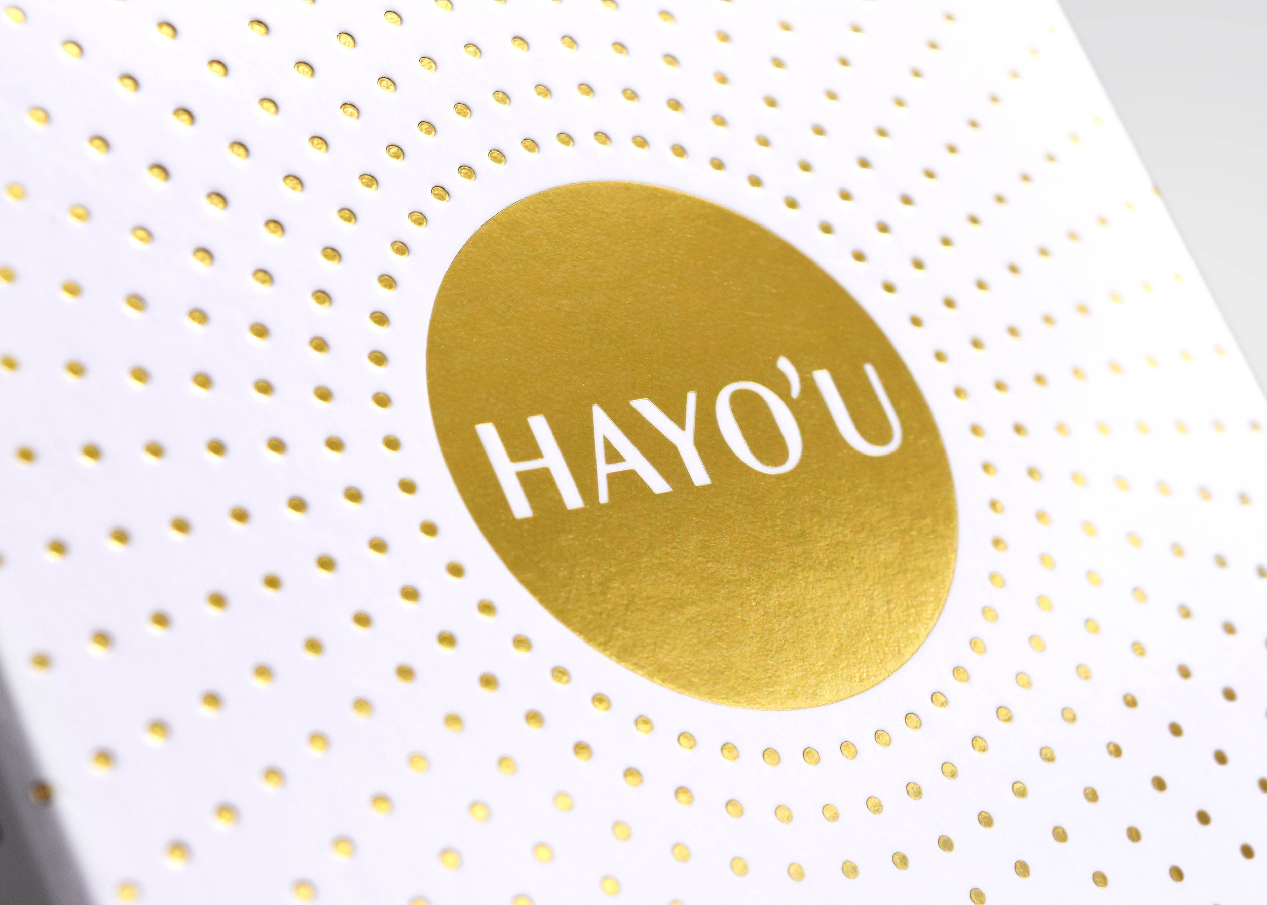
The Hayo’u brandmark is inspired by the Sun, an important symbol in Chinese culture, representing ‘yang’, light, heat and vitality. We enhanced this idea for the new packaging with radiating dots that expand and contract depending on the size of the pack format.
For more about the Hayo’u brand please visit their website.